Representations
The same data can be viewed and worked with from different perspectives. For example, a Kanban board is convenient for tracking the state of orders, a calendar for planning deliveries, and a map for monitoring logistics. To summarize a month’s work, you can build a chart of daily revenue or visualize conversions with a sales funnel. These different ways of visualizing and interacting with data are called representations.
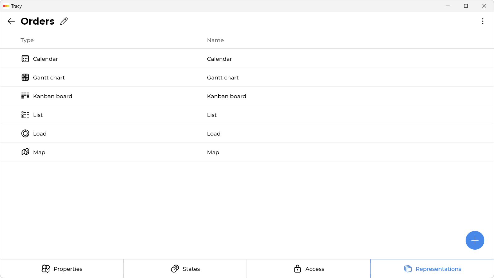
Each dashboard and each dataset can have multiple representations of one or different types (see below), which can be switched in the main area of the app. Dataset representations work with data from a single dataset, while dashboard representations can aggregate data from multiple datasets at once.
Representations are managed directly in the main area. Open the relevant dataset or dashboard, activate configuration mode by clicking the corresponding toggle at the bottom of the sidebar, and go to the representation selector below the name of the current dataset or dashboard—there you can switch between existing representations and add new ones.
Adding a Representation
To add a representation, click the “+” icon in the representation selector while in configuration mode.
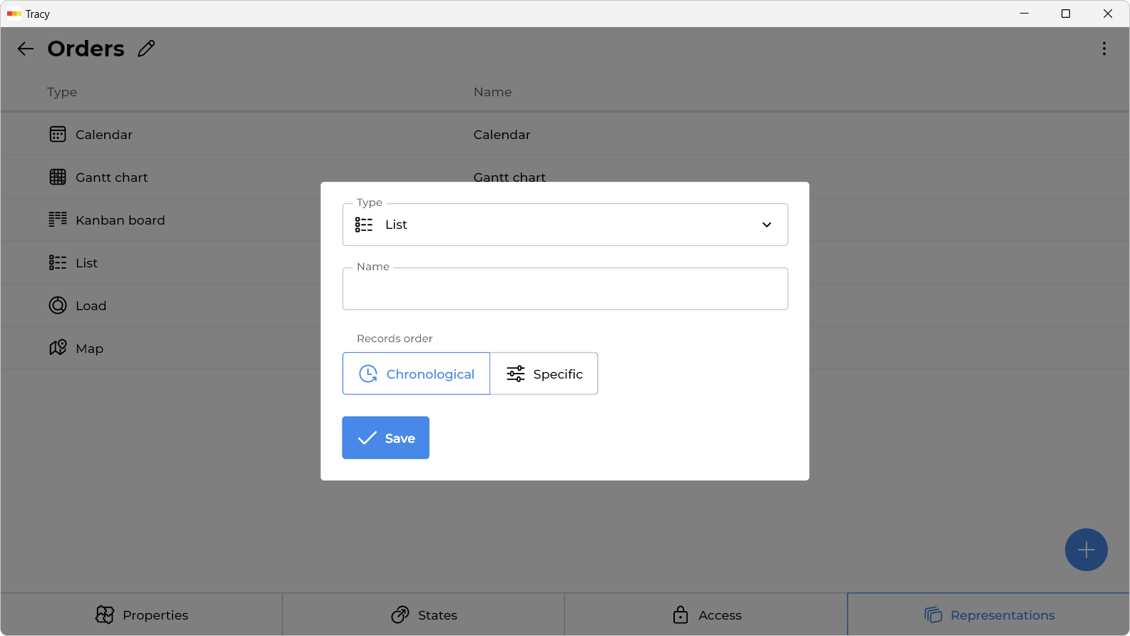
In the window that opens, specify the name of the representation, its type, any additional parameters depending on the selected type, and click the “Save” button.
Configuring Access to a Representation
By default, a representation is visible to all users. If needed, access can be restricted—either to users of specific roles or to specific individual users. To do this, select “Edit” from the context menu of the relevant representation in the selector while in configuration mode, enable the “Restricted access” checkbox, and select the desired users or roles from the list that appears.
Renaming or Editing a Representation
To change the name or other parameters, select “Edit” from the context menu of the relevant representation in the selector while in configuration mode, make the necessary changes in the window that opens, and click the “Save” button.
Reordering Representations
To change the order of representations, drag a representation to the desired position in the selector while in configuration mode.
Deleting a Representation
To delete a representation, select “Delete” from the context menu of the relevant representation in the selector while in configuration mode.
Representations Types
List
On devices with large screens, displays records as a table, while on other devices, they are displayed as a list of cards. It allows you to configure the order of records by selecting a property for sorting. Suitable for most cases, it is created by default when adding a dataset.
Kanban Board
Displays records as cards on a Kanban board with the ability to drag and drop them from state to state (drag and drop only works on devices with large screens). It allows you to configure the order of records in each column-state separately by selecting a property for sorting. It is convenient when a certain process takes place step by step every time, such as fulfilling orders, processing applications, conducting interviews, and so on.
Gantt Chart
Displays records on a Gantt chart using the value of one property of the “Date and Time” type as the start of the interval, and another property as the end. Optionally, it can also display the assigned user from the specified property. It is usually used for process planning, visualizing the sequence and duration of certain stages.
Calendar
Using the value of the specified “Date and Time” type property, it displays records in two ways: on a calendar or in a daily schedule. It can be used for scheduling appointments, providing services by appointment, and so on.
Funnel
Visualizes the conversion or losses at each stage of the process. A classic example of its application is the “sales funnel”, when at each stage of interaction with a customer, a part of them is filtered out, and only a certain percentage reaches real sales.
Efficiency
Displays on the graph the average duration of the process as a whole, as well as the average duration of each stage of the process separately. It can be used to compare efficiency, for example, of different shifts of employees in food delivery.
Load
Displays on graphs the load (number of assigned, for example, orders) for each user. Can be useful for calculating completed orders, analyzing efficiency, etc.
Chart
Displays on the graph the sum, product or average value of one property according to the date of another property. For example, it can build a graph of daily revenue from selling goods for a certain period.
Map
Displays records as markers on a map using the value of a specified “Map” property. Suitable for logistics planning, easier navigation, etc.
Gallery
Displays images from the specified property as a gallery with zoom and swipe capabilities.